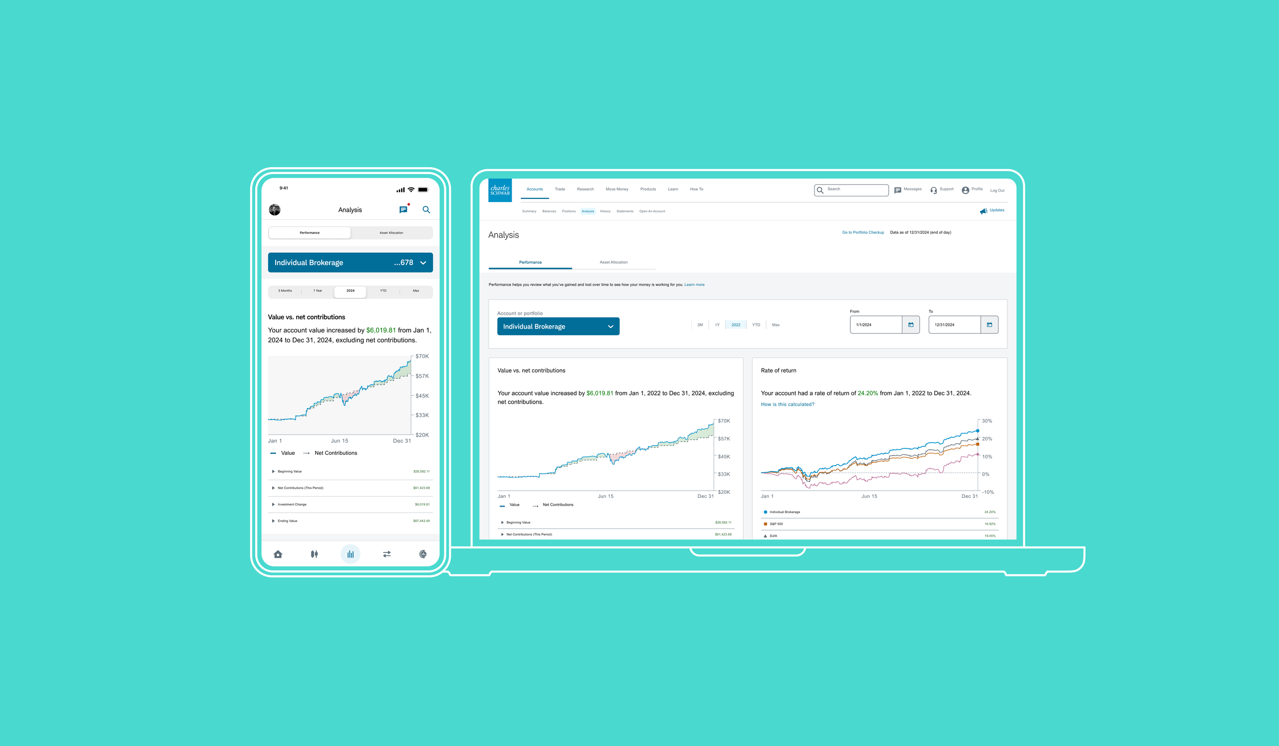

Schwab Performance
Schwab’s legacy performance tool had become a source of frustration for users, as it displayed data in a basic, spreadsheet format with only start and end points. This made it difficult to track performance trends over time. Our goal was to replace this with a more visual, intuitive tool that would make it easy for clients of all experience levels to understand their account performance at a glance.
Understanding the problem
With the old tool, users had difficulty understanding their account’s gain/loss over time or seeing the rate of return clearly. Without intermediate data points, clients struggled to piece together what happened between the initial and final data shown. Schwab clients—both novice investors and experienced users—needed a simpler, more visual way to interpret how their accounts were performing. Our task was to make the data intuitive and actionable for everyone, regardless of financial background.

Research insights
Our research team conducted a thorough three-month study that included client interviews, surveys, competitive analysis, and focus groups. We identified two main user personas:
Novice users who wanted a clear overview without the complex jargon.
Advanced users who needed access to in-depth data and metrics without feeling that the interface was overly simplified.
From this research, we developed guiding principles that would drive the project:
Provide clarity at a glance: Clients should be able to quickly assess their account’s performance over a given period.
Empower both novice and advanced users: The tool should offer in-depth options for experienced users, while being easy for novices to grasp.

Design principles & strategy
Our design strategy revolved around three core principles:
Simplicity: Present data clearly and minimize unnecessary complexity in visuals.
Accessibility: Follow WCAG 2.0 standards to ensure inclusivity.
Education: Include helpful bits of information to help users interpret account performance without overwhelming them.
We encountered an interesting challenge early on: Schwab’s gains and the client’s personal contributions needed to be shown separately to provide a true picture of account performance. To address this, we introduced a new metric—“Investment Change”—which visualized the difference between the client’s investment and the gain/loss in their account over time. This became the basis for a series of “aha” moments in the redesign, where simple data points helped clients see their account’s performance in a new light.

wireframes

REDESIGNING ACCESSIBILITY ISSUES

FINAL DESIGN

MOBILE BROWSER + MOBILE APP

Results and key takeaways
Our redesigned Schwab Performance Tool received positive feedback for its clean, intuitive layout and user-centered approach. Early user testing indicated a significant increase in ease-of-use, with clients appreciating the new Investment Change metric for clarifying their account performance. The real-time date selector was another major win, removing friction and making navigation feel more seamless.
Lessons Learned
Collaboration is essential: Working with engineers from the start allowed us to address technical constraints early, saving time and ensuring feasibility.
Designing for diverse users: Balancing novice and advanced client needs was crucial to create an inclusive, flexible experience.
Education is powerful: Including simple, contextual information helped clients interpret complex data without needing a manual.
What’s next?
With the success of this new dashboard, our next steps included adding more customization options for advanced users, exploring additional visualizations, and creating a paired experience so that users could understand how there assets were allocated.
Learn More
If you would like more a detailed presentation where I discuss the process, timelines, research, and end-to-end design, please reach out to me directly.
